Carousel | Overcoming Loneliness Together
Loneliness is a common issue in today’s society, especially among adults. It is often overlooked or dismissed and deemed as unimportant. Many people feel alone and disconnected even though we are constantly surrounded by technology and social media. The struggles of loneliness and isolation can lead to feelings of depression because of the lack of meaningful relationships. This problem is continuing to grow, due to factors like busy work schedules, moving away from loved ones, and evolving societal dynamics. It is crucial to address loneliness, there are numerous detrimental health effects that have been related to chronic loneliness like: elevated stress levels, weakened immune systems, and an increased risk of cardiovascular disease and early death. Also some psychological effects of loneliness can cause significant discomfort by weakening one's feeling of self-worth and belonging.
In reaction to these difficulties, Carousel appears as a ray of sunshine, providing a means of overcoming isolation and encouraging sincere relationships among adults. With the help of this community app, people will have a place to meet, exchange stories, and develop deep connections based on beliefs and similar interests. Carousel seeks to provide a space where people feel seen, heard, and valued via arranging community events, enabling virtual meetings, and cultivating a supportive environment. Through innovative features and a user-centric approach, Carousel seeks to break down barriers to social interaction and empower adults to forge authentic connections by using the power of technology for social good. Carousel shows how community building and working together can really help the challenges of loneliness.
Deliverables
-
My Role
Responsible for
creation, ideation, research, illustration, design and user testing.
-
Tools
Figma, Miro, Sketch & Milanote
-
Timeline
Five Months
-
Problem
Loneliness is a significant issue among adults today, often disregarded despite its serious impact. Factors like busy schedules and distance from loved ones contribute to feelings of isolation, leading to depression and health risks.
-
Solution
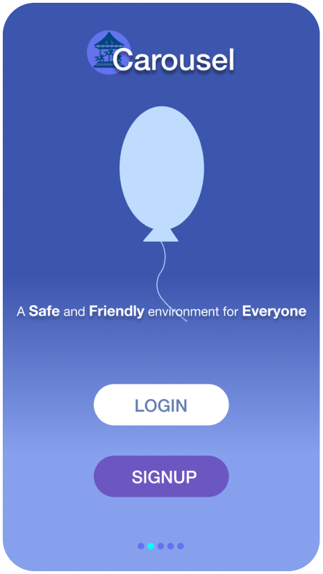
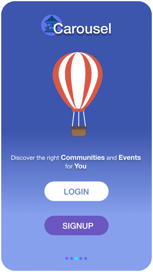
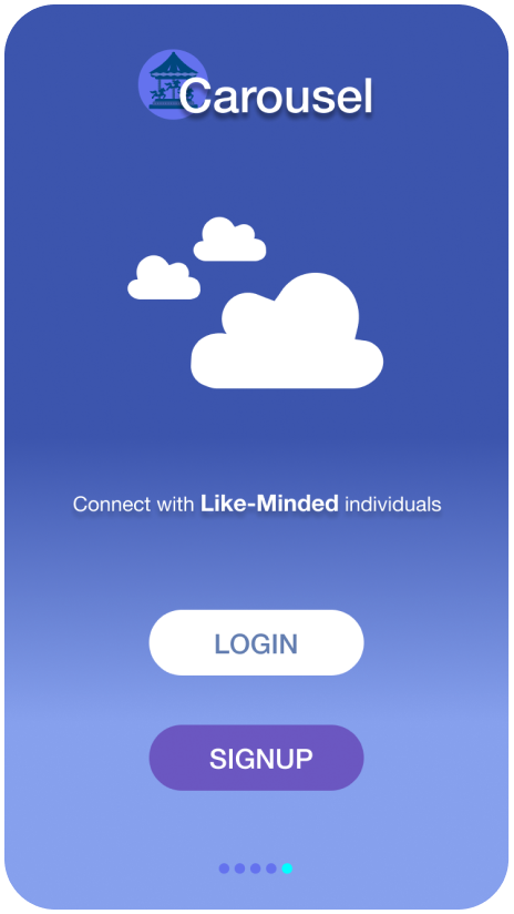
Carousel, a community app, offers a solution by providing a space for adults to connect, share stories, and form meaningful relationships. Through features like virtual meetings and community events, Carousel aims to break down barriers to social interaction and empower users to combat loneliness together.
The Process …
Define
After gathering all my research & user survey results, I interviewed 3 people and started the process to define the problem with an affinity map, empathy map, & a user persona. I used Miro to put together the affinity map & empathy map, I conducted the heuristic analysis and used Figma to create the user persona.
Affinity Map:
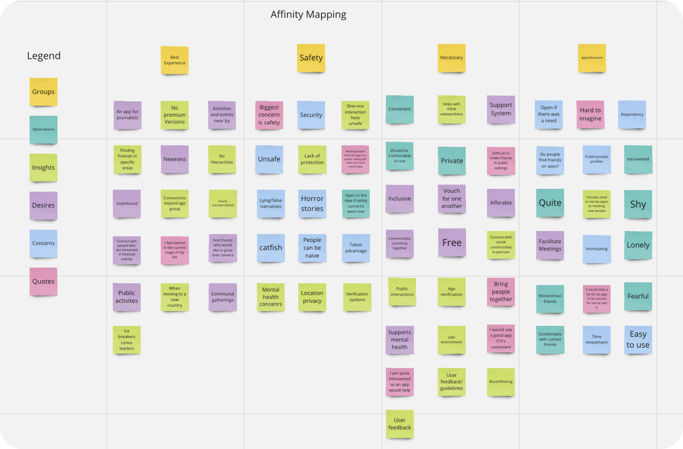
The affinity map includes observations, insights, desires, concerns, and quotes that were collected during the interviews. Some things that stood out during this process and were consistent among the interviewees was the importance of safety while using the app and what features are required in the app to ensure the best experience. This process is helpful in recognizing patterns and prioritizing what is required. Overall, affinity mapping is a quick, and visual way to synthesize and prioritize information, allowing designers to transform the data collected during the interviews into actionable insights.
Empathy Map:
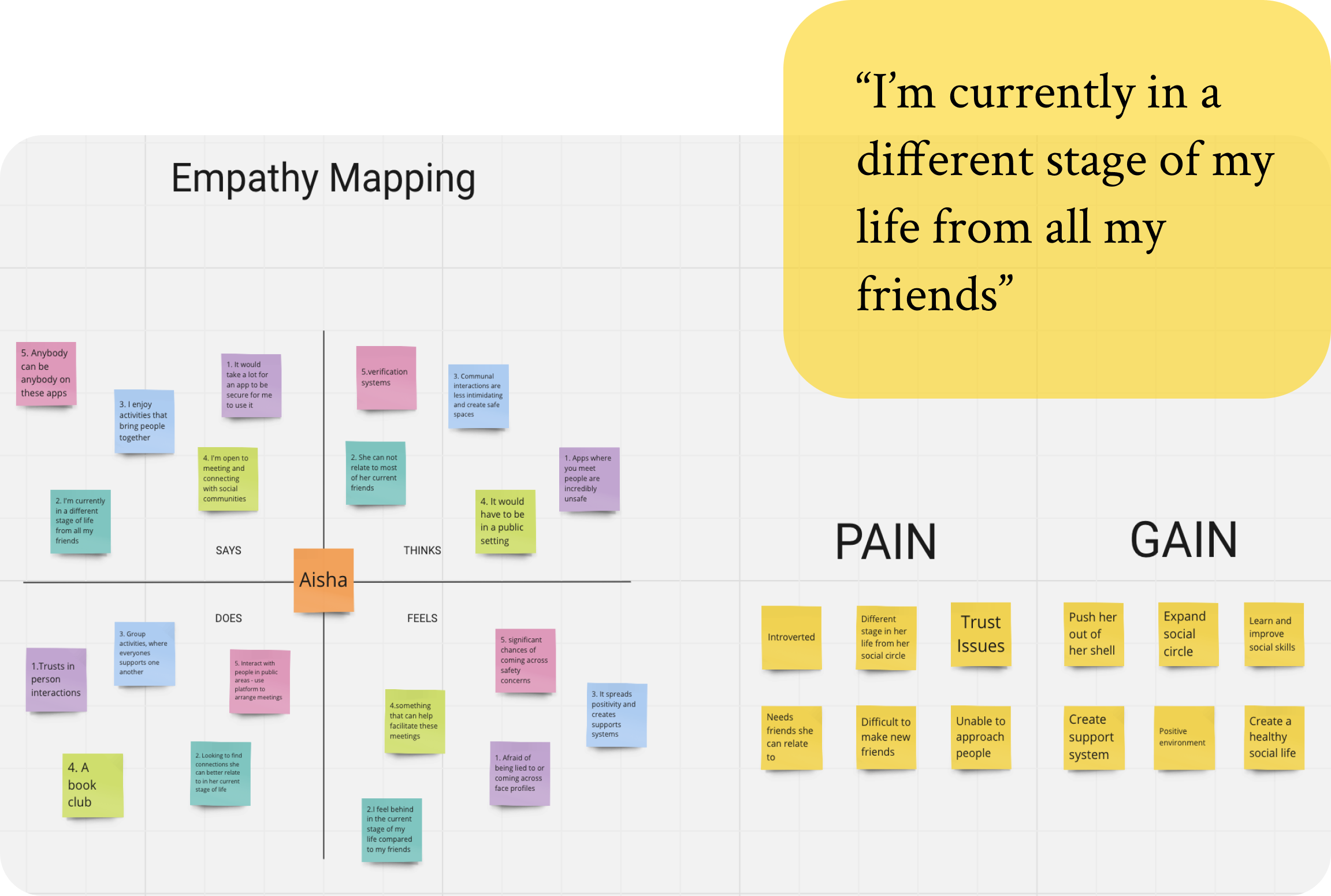
The Empathy Map is based on information collected during user interviews. Here, as designers we are able to understand user perspectives which is essential for creating user-centered experiences. In the empathy map, the users pain and gain points are identified, to better understand the users and create a more impactful product.
Persona:

A user persona brings clarity and focus to the design process, providing a realistic representation of the target audience. For Carousel the user persona is Elena, she has recently moved to a new country. Elena has no friends of family in the area and feels incredibly lonely. Elena would be an ideal user for Carousel, she would gain a valuable experience from the app and be satisfied.
Ideate
Now it was time to transition into the Ideation stage. I created Lo-fi Sketches, HMW statements, User stories, Wireframes, Mood board, UI Guide, Site maps & User flows, to document all of my thoughts and ideas.
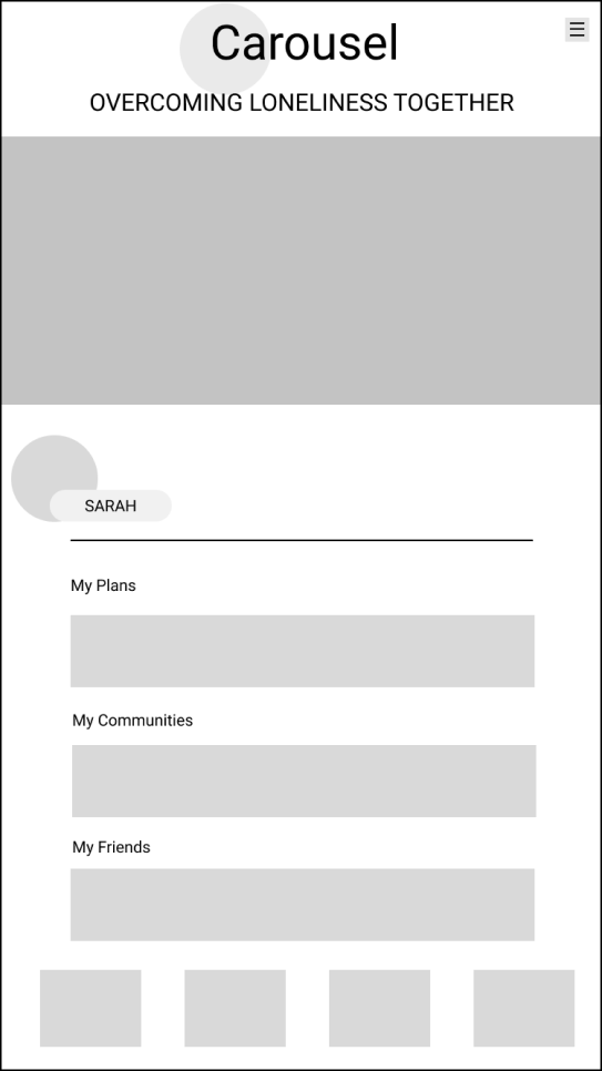
Low-fidelity sketches:


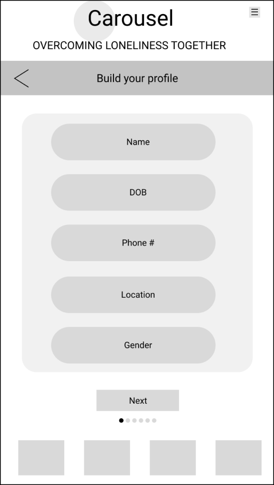
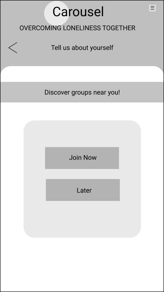
Wireframes:


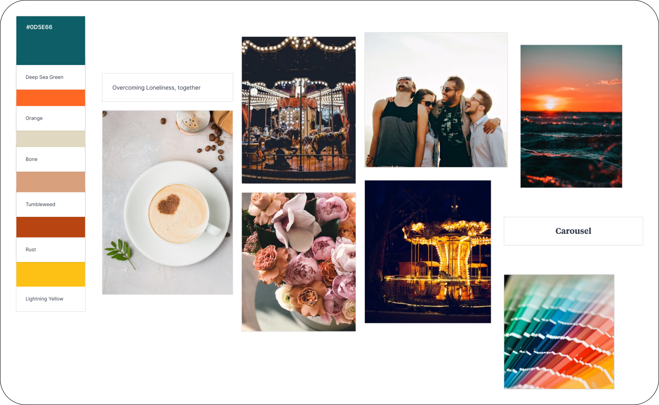
Moodboard:


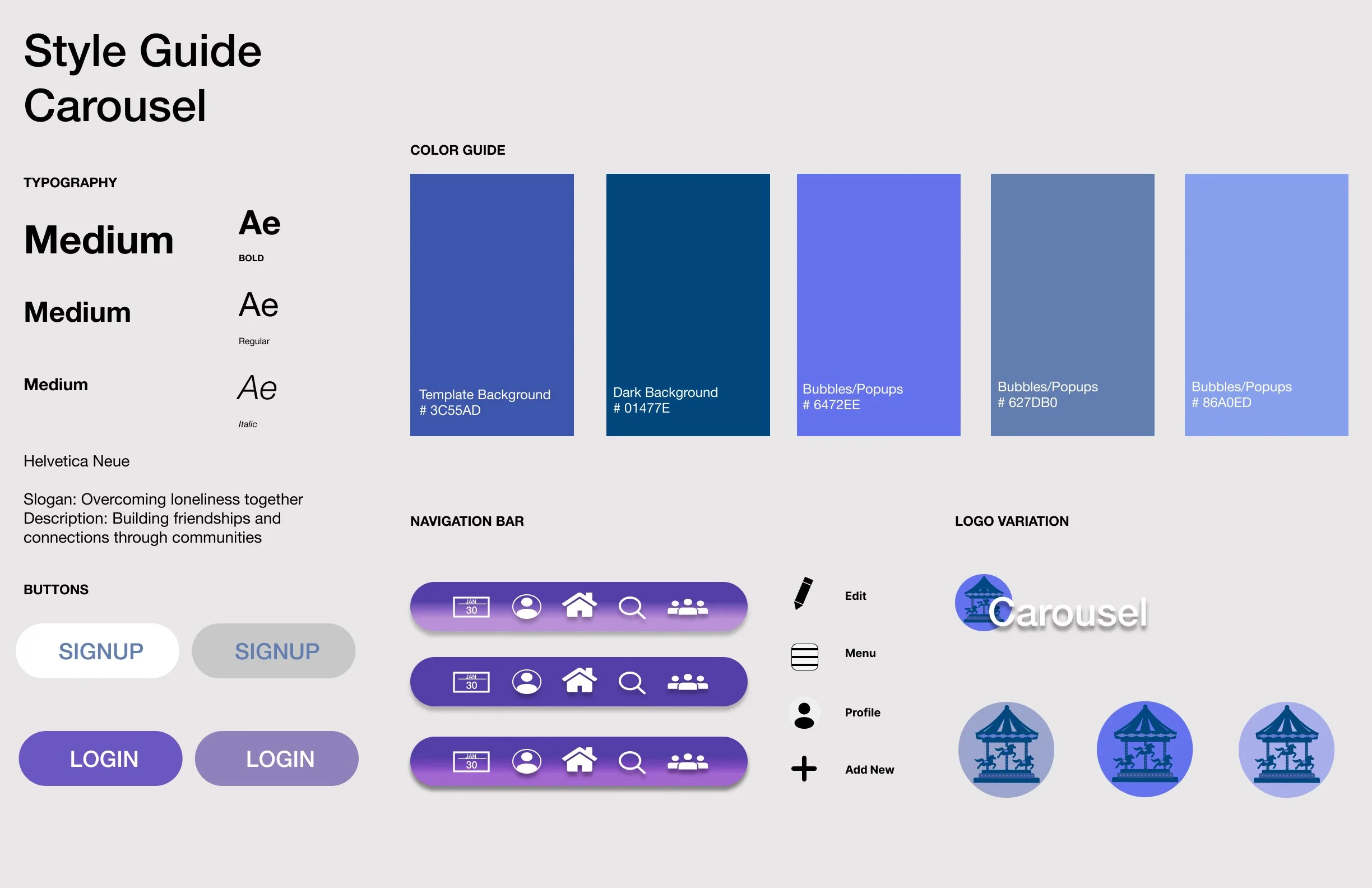
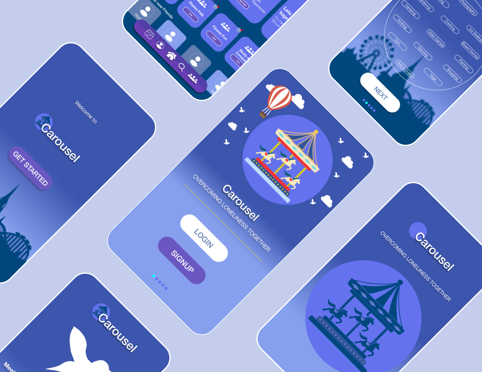
Style Guide
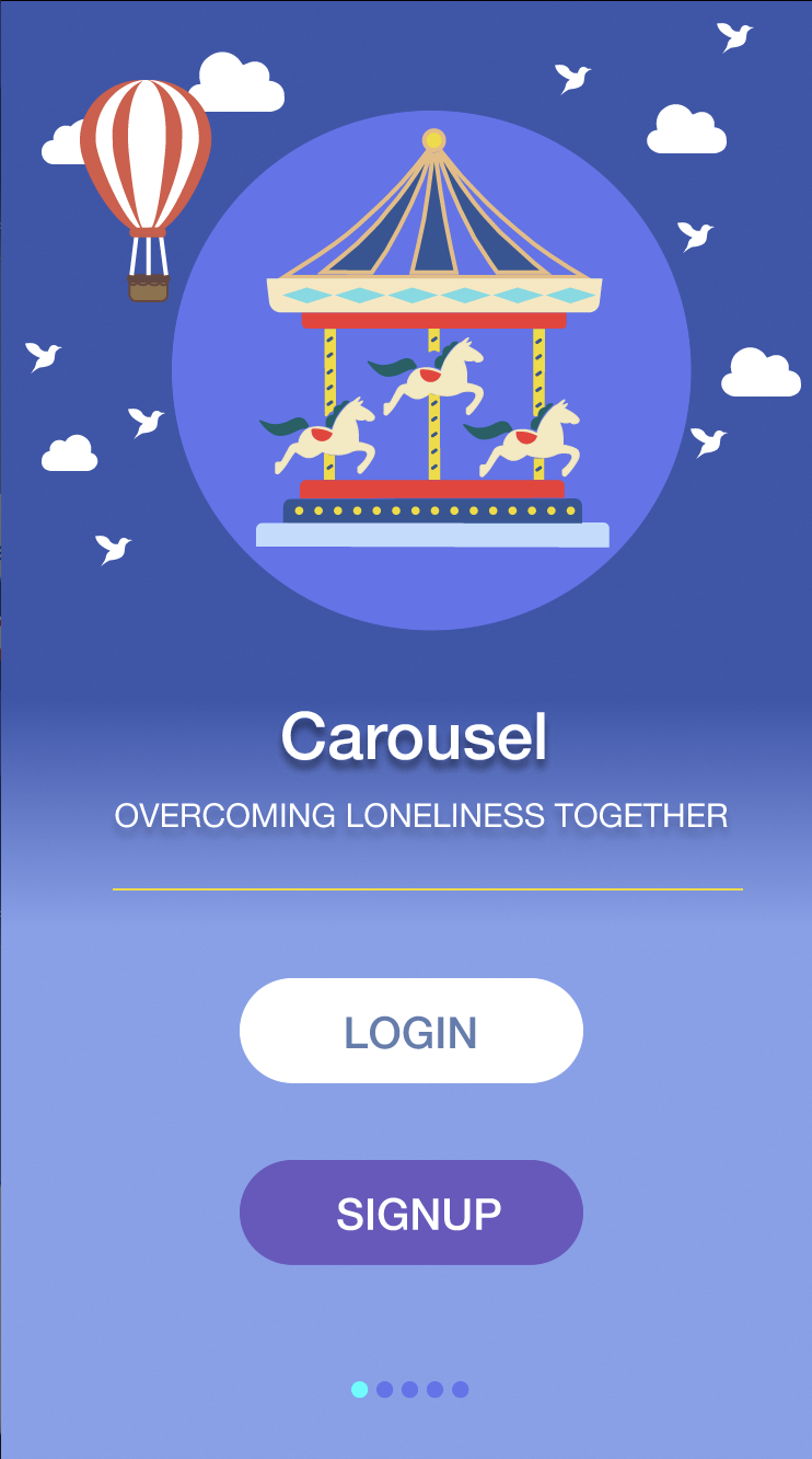
The style guide for this app focused on transitions of colors. The theme surrounded cool tone colors, transitioning between purples, blues, and navy. Choosing this UI for the app was very important to me, I wanted the colors to speak to a user and make them feel as if they were riding a carousel underneath the night sky. I incorporated touches of white throughout the app to break the cool tones with a touch of warmness. Carousel is an app that is inviting, fun and cheerful, it imitates our childhood when we had no worries and the UI of the app help get that message across. Allowing for users to feel hopeful in their journey to build and form new connections, overcoming loneliness.

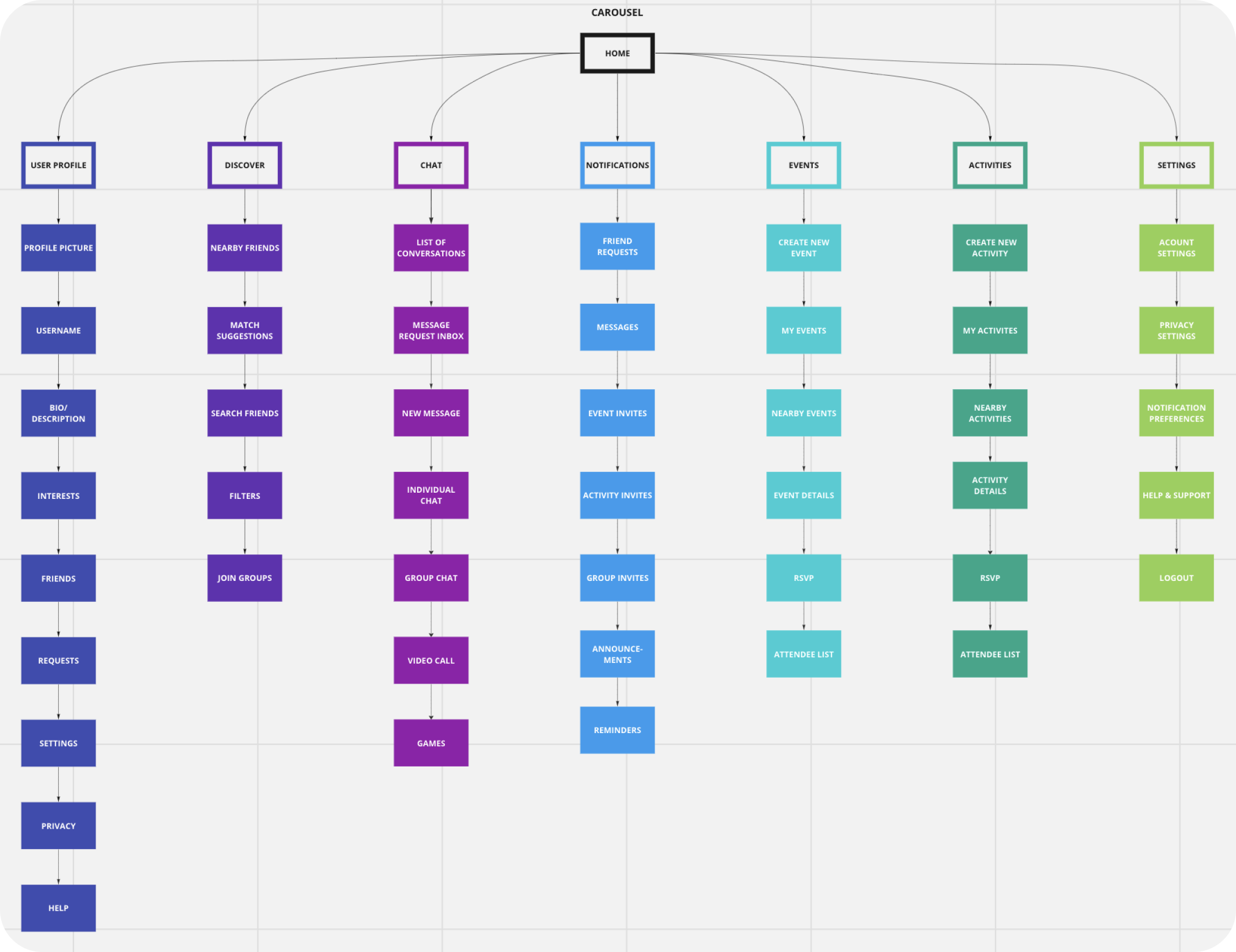
I created a low fidelity site map to map out the navigation and to understand how many screens I wanted to include in the app. This process also helped me eliminate any screens that were repetitive and not necessary. It helped me narrow down the best paths for the user.
Site map & User flows
Then, I went into Miro and created a high fidelity site map. I was able to organize, add color and enhance readability. At this stage I could see the app coming to life.
Later, created user flows for all navigations between Login, Onboarding and events. Mapping out the paths a user will take during these process is crucial to ensure the user is having a logical and smooth experience.


Prototype & Test
The final stage was to Prototype and conduct Usability Testing. I examined the screens and started polishing them by adding colour, custom-made vector illustrations, text, and all the final UI essentially. Bringing all of my ideas, research, flows, and sketches to life! For Usability Testing, I conducted 3 rounds of user testing, made final iterations and my original idea with Carousel was brought to life!
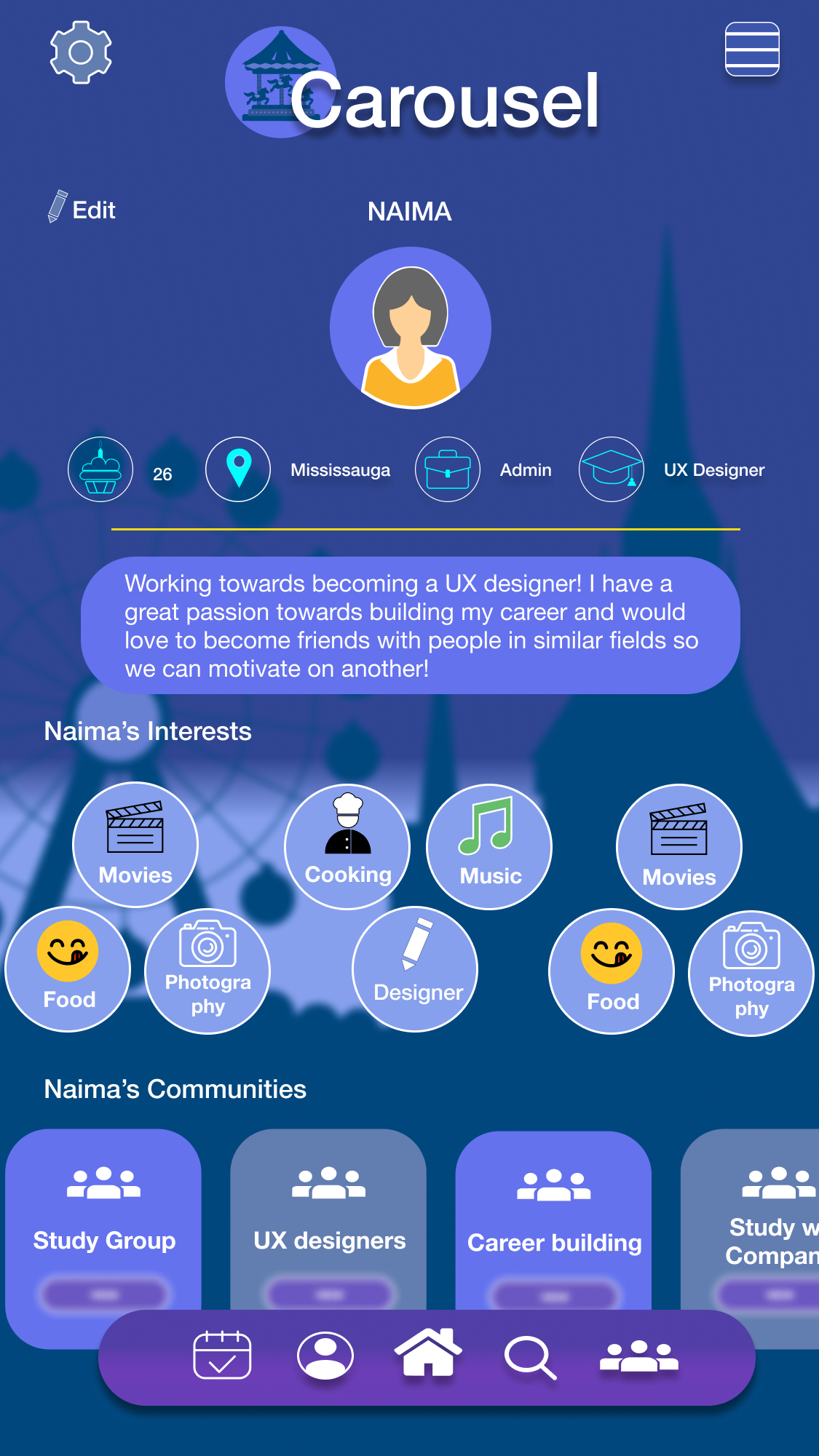
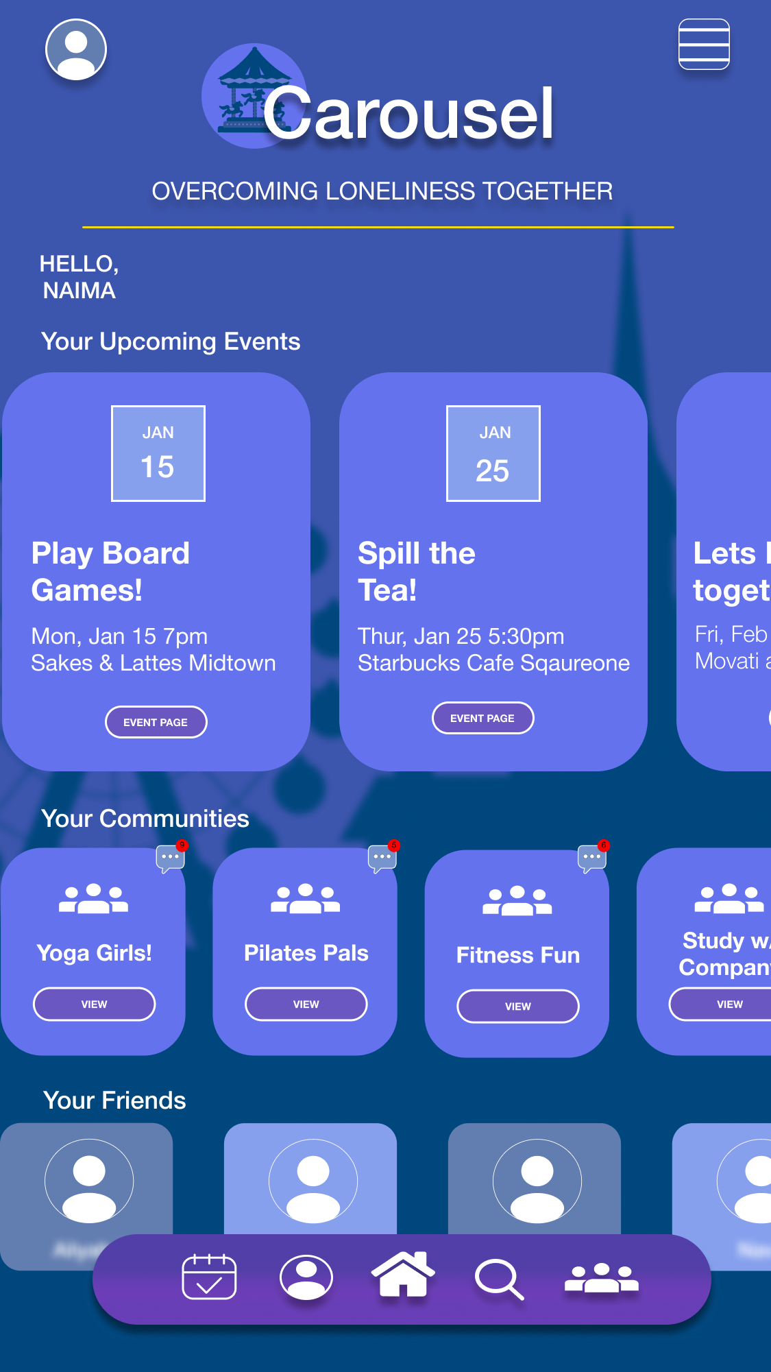
HIGH-FIDELITY PROTOTYPE: One of my favourite parts of this entire process was creating custom UI for all these screens in Figma. One of the most challenging screens for the custom made vector illustrations was my home screen, creating the Carousel with the horses on it along with every little detail took me some long and challenging hours, but looking at the final result it came together really well in the end.


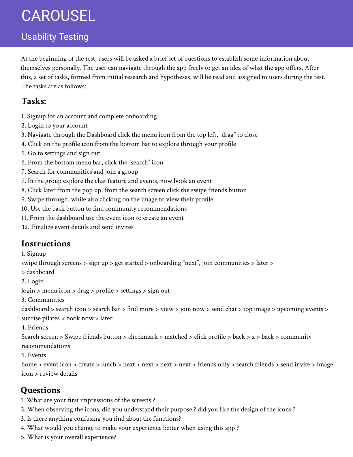
Usability testing plan
Carousel completed 2 rounds of usability testing. These were the tasks and questions that were asked.
ROUND 1 OF USER TESTING
The overall key findings from this test report showed that participants were able to complete their task but commonly encountered some issues related to font sizes, confusing buttons/icons, and design clarity. Participants found the tasks to be straightforward, but consistently across all participants they found some text difficult to read comfortably. The purpose of the events icon was misunderstood and mistaken for a calendar. All participants struggled with the drag-to-close feature in the menu screen. Recommendations included implementing larger fonts and buttons for improved readability, providing alternative ways to close screens besides drag-to-close, redesigning confusing icons, and enhancing color contrast and clarity to make buttons and icons less distracting and more discernible. Incorporating more imagery was also suggested to supplement text-heavy sections and enhance overall visual appeal.
ROUND 2 OF USER TESTING
After synthesizing my findings and determining the changes that needed to be made, I went ahead and applied those changes to my prototype before my second round of testing. I took into consideration all the recommendations and suggestions that were made, as participants expressed discomfort and I wanted the user experience to be as friendly as possible. The second round of testing went incredibly well, 3 new participants tested the prototype and had amazing experiences overall, no discomfort was expressed and all tasks were completed successfully!
Conclusion
The journey entailed understanding the unique needs of adults seeking to build new friendships, ideating around core principles, and refining the app through rigorous usability testing. The resulting changes demonstrate a steadfast commitment to creating a safe, welcoming environment where everyone can form connections and overcome loneliness.